UX design: colours on the web
About the effect of colours and what image they convey to us.
by Cand. Scient. Christina Hochleitner
Colours influence how we perceive a website or a customer portal and give users constant feedback. The usability and design process in web projects at RISC Software GmbH is initiated at a very early stage. Read here how colours are handled together with the experts at RISC Software GmbH and what impression the different colours leave on the viewers on the web.
Table of contents
- What colours trigger in us: study
- Colours: the right choice
- Two special colours: red and green
- Author

What colours trigger in us: study
Joe Hallock conducted a study on colour perception with 232 participants in 2003 (http://www.joehallock.com/?page_id=1281#pref.). He found that the colour “blue” was most frequently stated as a favourite colour by both men and women. Purple was very polarised and, for example, was only mentioned as a favourite colour by women (23%) – among men, “purple” did not appear at all. The researcher also asked the participants to describe colour associations with “safety” (result: blue 28%, black 16%), the perception of “speed” (result: red 75%) and “cheap” (result: orange 26%, yellow 22%, brown 13% – no clear result). For “high quality”, 42% of the respondents give black and 18% blue as an association.
If you look at these results in relation to colours on the web, you can quickly find examples where these colours are used quite deliberately by well-known brands. For example, it is not surprising that Apple (apple.com) uses the colour black as a leading and background colour. The food discounter Lidl (lidl.at), on the other hand, impresses with very colourful advertising where many different colours are used.

Colours: the right choice
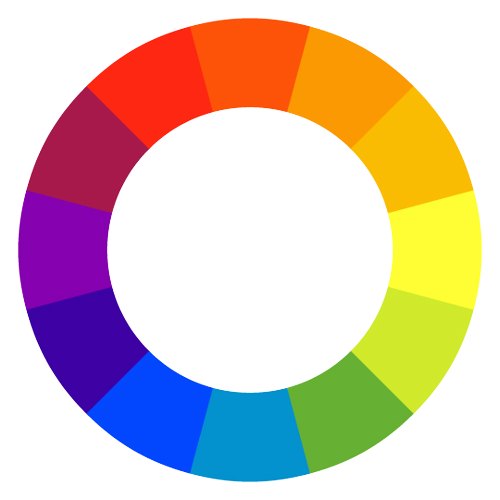
The use of colours in your web project will of course depend on the existing corporate design in most cases. The colours you want will be included in the colour decision and we will be happy to advise you on a more precise selection of the matching highlighting or secondary colour. On the web there is also a comprehensive selection of so-called “colour wheels” (https://color.adobe.com/de/create/color-wheel), which provide suggestions for colours that harmonise with each other based on different colour theory methods (e.g. complementary colours, colours arranged in a square on the colour wheel,…).
Two special colours: red and green
The colours red and green are a topic of their own, as these are already very strongly pre-assigned on the web. Thus, the appearance of green colour usually stands for the statement: “Everything fits – continue” and red for the signal “Stop! Something has gone wrong here”. The use of these two colours in a different context can therefore very easily lead to usability problems on the web and should be carefully considered.
At the beginning of a web project, the colours are discussed in a design sprint and determined together with you. Colours on the web are incredibly important because: “Color does not add a pleasant quality to design – it reinforces it.” – Pierre Bonnard
Contact
Author
Cand. Scient. Christina Hochleitner, MSc
Research Coordinator